-
The annual American Banker/Reputation Institute survey ranks the health of consumer perceptions regarding 30 of the biggest names in retail banking. Is there a prescription for what ails these institutions?
June 22 -
A year and a half after completing its recapitalization, Sterling Financial Corp. in Spokane, Wash., has been released from an enforcement order with the Federal Reserve Board.
March 8

On its face, it may appear cosmetic, but a new brand identity can distance banks from the anger many customers still feel over the financial crisis.
A logo change isn't cheap, but it "can remove some of that taint," says Jeffry Pilcher, a consultant and the publisher of bank marketing website The Financial Brand.
To their credit, banks seem to get the importance of living in the here-and-now. They have
Doing so "helps show that you're an evolving organization, and not one that's stuck in the mud," Pilcher says.
Bankers considering such a transformation often meet resistance from directors. When Investors Bancorp in Short Hills, N.J., pitched a plan in 2008 to change its bank's name and logo, it fell with a thud, says Domenick Cama, the company's chief operating officer.
"The board completely rejected the idea," Cama says. "A lot of [directors] had a strong emotional connection to the bank and were opposed to changing anything that had a strong emotional impact on them."
As Investors considered the virtues of becoming more like a commercial bank, however, directors became more open to a new logo, Cama says. Investors changed its bank's name last fall to Investors Bank, dropping "Savings" from the name. A new logo followed.
It was important to convey to clients that the bank had not been sold, Cama says. So executives chose a logo with a weave design, to show that the bank was "interwoven into the community," he says. "We didn't want customers to think that our bank had been taken over."
Cama would not say how much the $11.3 billion-asset company spent on the logo, beyond calling it a "significant investment." The entire process, from the initial pitch to the last sign change, took about 18 months, he says.
New capital structures have also prompted logo changes. After Sterling Financial
"We recapitalized, and we were at a place where the bank was going through new leadership and turning a different corner," Dickinson says. Sterling raised the funds after it was hit with an enforcement order requiring it to suspend dividends and boost capital.
The $9.5 billion-asset Sterling, like Investors, dropped "Savings" from its name, evolving into Sterling Bank in February. At the same time, the company unveiled a new green-and-gray logo for Sterling Bank and Sonoma Bank.
Dickinson also declined to discuss the costs of implementing Sterling's changes, which took about 24 months to complete.
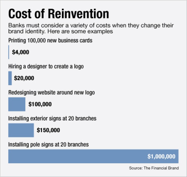
The costs of reinvention vary based on a bank's size and how many image-related elements it wants to change, Pilcher says. Including redesigning a website around a new logo, erecting new signs and printing new business forms, most banks should expect to spend at least $1 million.
The associated expenses also make it a tough pitch for cost-conscious directors. "One of the hardest things I've had to do is sell a logo change," Pilcher says.
"It's difficult to say there's a return in the financial sense," he adds. "You can't say that it's going to make you a certain amount more money. But there's nothing wrong with spending money to change the logo, as long as you've got the capital reserves."
A change in ownership prompted a new logo at the $12 billion-asset BankUnited in Miami Lakes, Fla. After the thrift failed, it was sold in 2009 to a group of private-equity firms. The new management team dropped the logo's palm tree and adopted a modified arch as the bank's symbol.
The time could be ripe for the biggest financial institutions to alter their logos, Pilcher says. Bank of America may be open to making a change after all the bad publicity it has sustained since the financial crisis, Pilcher says. It would be like putting on a new set of clean clothes, he adds.
"You have to ask, how much distancing do you need to do from your past?" Pilcher says. "Bank of America has had it the worst of anybody. If they were to roll out a new logo, it would convey to the world that it's much more than just a marketing thing."
T.J. Crawford, a B of A spokesman, declined to comment.
The Charlotte, N.C., company has recently changed its marketing approach, naming WPP as its global advertising agency of record and increasing responsibilities for the firm Hill Holliday.


